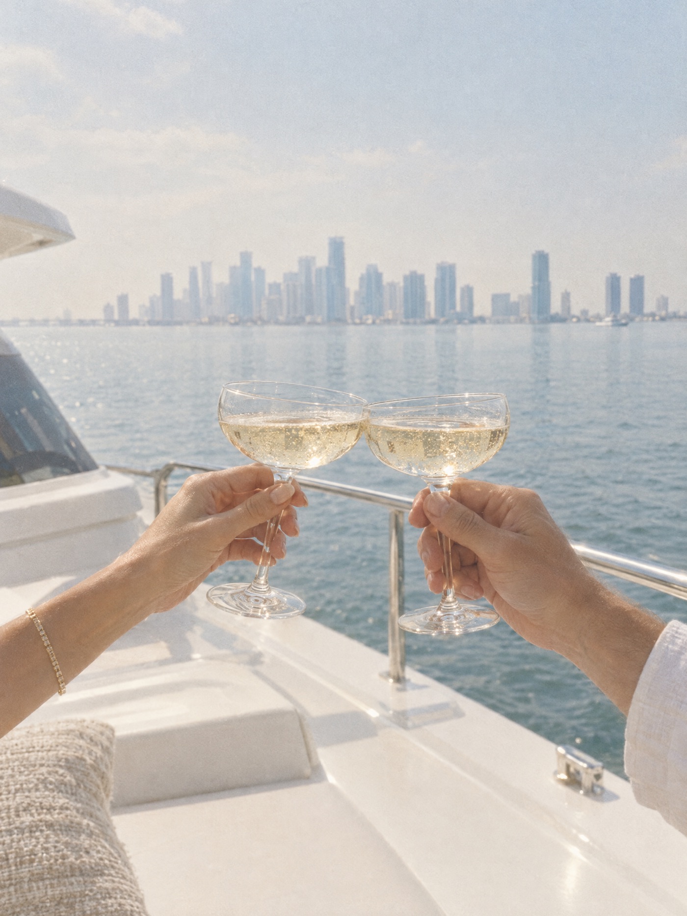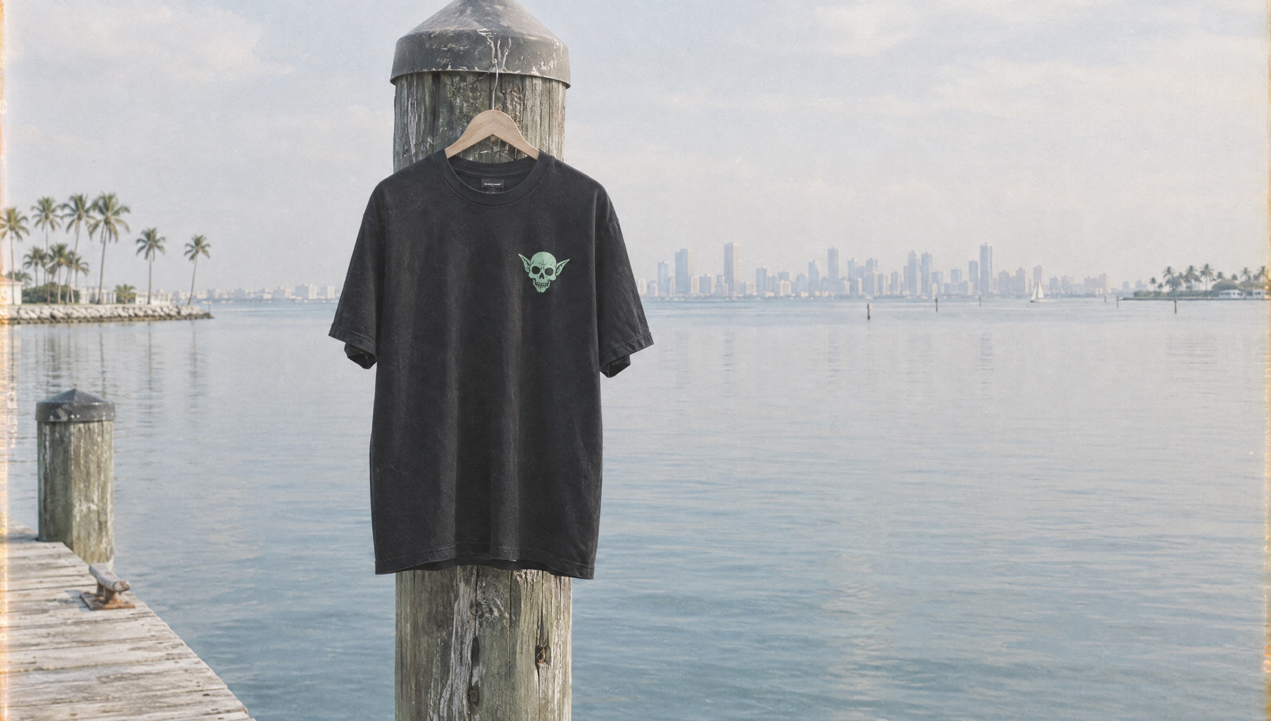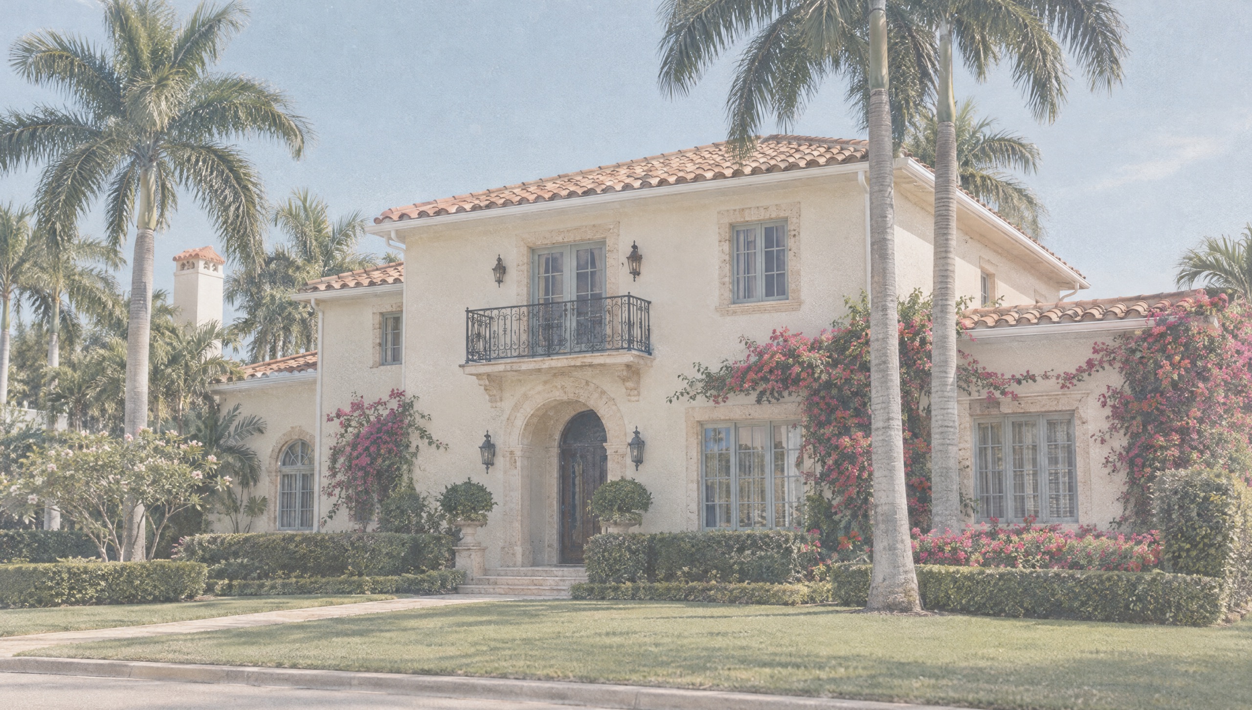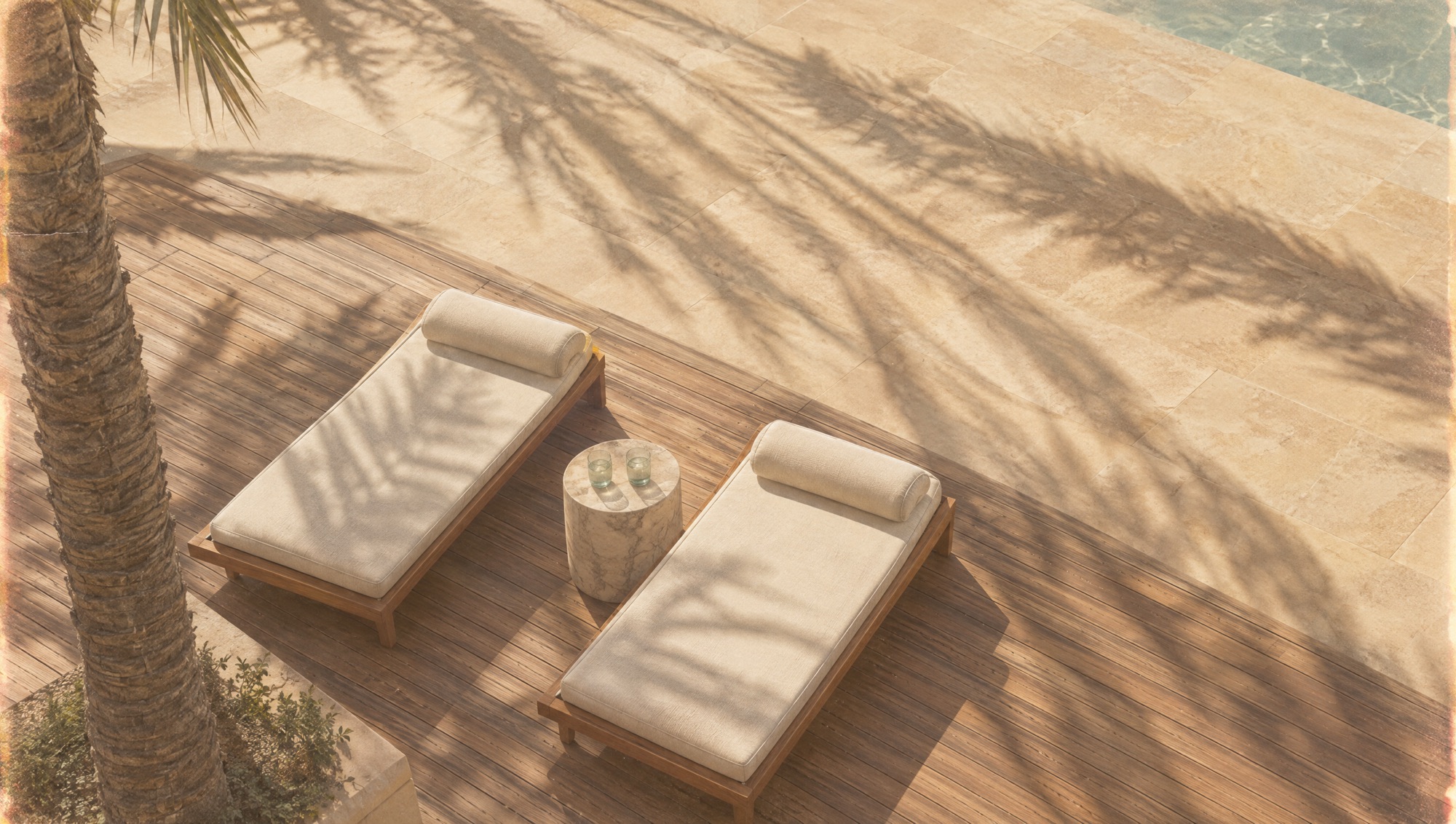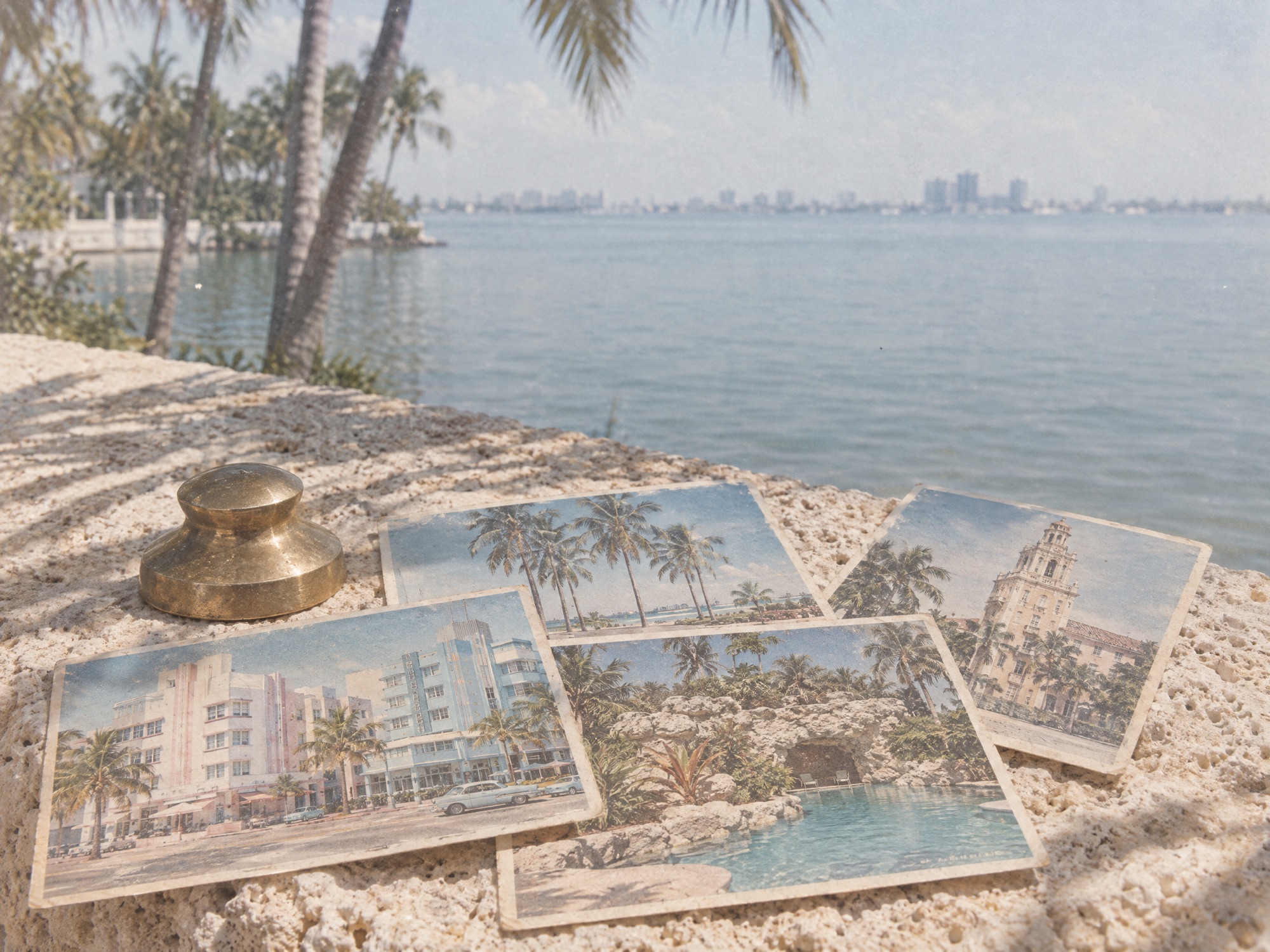
The studio brand has two moods, and we use both on purpose. The dark tones do not scream. They intrigue. The coastal light does the opposite: bright imagery, a pop of coral, water everywhere.
When we use which
Dark for the parts that need weight: services, results, the invitation to talk. Light for the parts that need air: who we are, what the work looks like, the news. The page moves between them the way the tide does.
A brand is not a color. It is the rule for when the color changes.